When OK! Magazine gets in touch and asks you to analyse the future King of England’s new home, you say yes. Obviously.
I’m genuinely thrilled to share that I was featured as a design and colour psychology expert in the most recent issue of OK!, analysing William and Kate’s design choices at Forest Lodge in Windsor Great Park, the property the Wales family moved into this week and which has been described by those close to them as their forever home. My quote made the cover, which still feels slightly surreal *cue all the eeks *
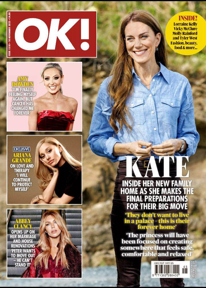
The piece was written by feature writer Anna Pointer, and if you want to read it in full, pick up a copy, it’s a really lovely cover feature!
Here’s a more detailed look at the thinking behind what I shared with them.
What Forest Lodge tells us, before we see inside it
The first thing I notice when I look at Forest Lodge is the building itself: warm red brick, Georgian proportions, white-framed arched windows, deep-set doorways. It is clearly a building with a lot of history.
Architecturally, to the casual observer it reads ‘old and substantial’. Aside from its clearly spacious size and gorgeous ‘bones’ it’s not shouting ‘luxury’ trying to impress you. The brick absorbs light rather than reflecting it; the proportions are generous without being grand in the way a palace is grand. If you were searching for a home and briefing a colour psychology expert like me on the emotional signal you wanted it to send, this building would probably be described as ‘grand but not pretentious’.
The Fireside aesthetic: what we’ve seen before
In rare glimpses into the Wales family’s previous properties, I’ve consistently noticed what I’d describe as a ‘Fireside’ aesthetic. For those unfamiliar with the Colour Brand® framework I use in my work, Fireside is one of four personality types I’ve identified in my method, and it describes a design sensibility that mirrors ‘Autumn’ and leans into warmth, texture, layering and genuine lived-in comfort.
The Kensington Palace apartment, glimpsed in video footage over the years, showed a warm palette of creams, khakis and pinks, with touches of warm wood and what appeared to be warm brass accents. Florals, soft furnishings, family photographs, traditional artworks.
In Anmer Hall, their Norfolk retreat (where Kate filmed the deeply moving video announcing the end of her cancer treatment, surrounded by family at a round kitchen table), the room was warm and close and intentionally intimate.
None of this is accidental. These choices cluster around a very clear psychological intention: to make the people inside feel safe, held and at home. Fireside interiors trend away from today’s cooler obsession with gloss white and grey, and towards warmth, texture, keepsakes, art and pattern. They feel genuinely lived in, and that ‘feel at home’ type of use is exactly the type behaviour they often encourage.
As I said in the article: “Fireside interiors tend to trend away from today’s obsession with minimalism, gloss white and grey, and towards maximalism, with plenty of texture, keepsakes, art and patterns.”
How recovery shapes a home
There’s something I thought about carefully before including in my comments to OK!, because I wanted to say it with the care it deserves. Kate’s treatment and recovery from cancer will, I believe, have influenced how she thinks about this new home.
When you’ve been through something that challenges your health in a way that threatens your life, it fundamentally reorders your sense of what matters, and as a result your relationship to your physical environment changes. You may stop tolerating spaces that feel wrong. You may become much more deliberate about what you allow into your home, what you spend time looking at, what you want to be surrounded by. The things that regulate your nervous system, that remind you of love and connection and being alive may become not just nice to have but a top priority.
The environmental psychology research on this is substantial: spaces that feel safe, warm and personalised actively support healing, reduce stress responses, and help regulate the nervous system. Colour, texture, natural light and familiar objects all play a role. A home that feels like a sanctuary shouldn’t be a luxury for someone in recovery, because it’s such an important part of the care itself (hence why we see hospitals moving away from white, sterile decor).
As I put it in the article: “I expect she’ll have been very focused on creating a welcoming home that feels safe, comfortable and relaxed, and an environment that reminds her what truly matters: love, joy, health and being together.”
What to expect from Forest Lodge
Based on my research, everything I’ve observed about Kate’s design instincts in the past, and the nature of the building itself, I’d expect efforts will be made to make Forest Lodge feel warm and personal from the moment you step inside. The entrance hall (visible in photographs from when it was renovated in 2001) has deep arches and high ceilings that create a natural grandeur, but the family’s pattern is to bring grand spaces back to human scale with warmth and layering.
I’d expect to see plenty of natural materials, soft furnishings in the cream-to-warm-gold range, plenty of family photography and the particular kind of purposeful objects that signal a house is genuinely lived in rather than styled. Houseplants, children’s artwork, books that have actually been read. Despite belonging to royals, I expect Kate will be creating the kind of home where her children can kick off their shoes off and sit down without feeling like they’re about to ruin anything.
The gorgeous greens of the natural landscape outside will no-doubt be pulled through into the interior palette (most psychologically settled homes tend to have a conversation between their outside and inside), and I’d expect a colour continuity between rooms that makes the whole property feel like it belongs together.
Why this matters beyond the royals
Writing about William and Kate’s home may seen like an unusual departure from my usual terrain of high-impact rebrands and colour psychology for women building businesses. But the principles at work here are the same ones I use with every client, and the same ones I write about when I’m talking about colour in the context of everyday life.
The colours we choose for our homes are always communicating something about what we need, what we value and what makes us feel like ourselves. Whether you’re the Princess of Wales designing a forever home after a year that fundamentally changed you, or you’re a working mum standing in the paint aisle on a Saturday morning trying to decide whether the warm cream or the cool grey is the right call for your kitchen, you’re navigating the same psychological territory.
You’re probably asking: what do I need this space to do for me? What do I need to feel when I walk through the door? What matters to me enough to put it on my walls?
These are the questions that will lead us to the kind of spaces that we actually like being in, and that truly support our well-being.
I was featured as a design and colour psychology expert in OK! Magazine, November 2025. The full article, written by Anna Pointer, is available in this week’s print edition.
If you’re curious about colour psychology and what your own home or brand choices might be telling you, the Brand and Colour Personality Quiz is a good place to start. And if you’d like to explore your personal colours more deeply, Colour Joy is the programme I built for exactly that, and it’s available free when you join as a founding member of my substack.
with love, xx Nic